Making the First Impression: Recruiting Flyers
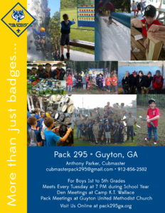
So this year, I got charged with making the recruiting flyers. We distribute these at the open house for our local elementary school. There is a recruitment on the one side and information for our “welcome to the Pack” ice cream social on the other.
I scoured the interwebs looking to see what other Packs did for theirs. So much talent out there. I came up with a theme that I felt conveyed what our Pack is at our heart: More than just badges. From there, I went and lifted various photos from our last Scout year, opened a new document in Photoshop, made a little collage, then added the info to the bottom. Because our school also had pre-k and kindergarten, and we sadly do not have the Lions program in our council, we were specific to add the grade levels for Scouting on the flyers. I also made sure to denote that we are family-friendly and that siblings are invited to participate in our activities and outings, which I hoped would be a big draw.
Ultimately, you know your community and what will get them in the door. If you are drawing a blank, just do a google search like I did, or check out this thread on the Cub Scout Volunteers facebook page featuring other pack flyers.
 |
 |
I’ve been a web developer since 1997, but am not a graphic designer (I make things functional, not pretty). I just know enough basics to get by in Photoshop thanks to the graphic designers who worked with me for many years before I exited the industry professional in 2015.
